Importance of Minimalism in UI Design
December 26, 2019 9:24 am | by Mohit Bairwa | Posted in Tech
Ever visited a website to read or to buy something, but you instead got bombarded with a plethora of information, and that made you leave the website immediately. It is an example of bad UI, and that’s where the essence of minimalism in UI design comes into play.
100 Minimal screens > 1 Cluttered
- What is minimalism and why is it gaining momentum?
As the name implies, Minimalism is just keeping things simple. Minimal is, use of the fewest and barest essentials or elements, as in the arts, literature, or design. Minimalism is one of the most influential styles today. In fact, there’s every chance that you’re a fan of minimalism even without knowing it.
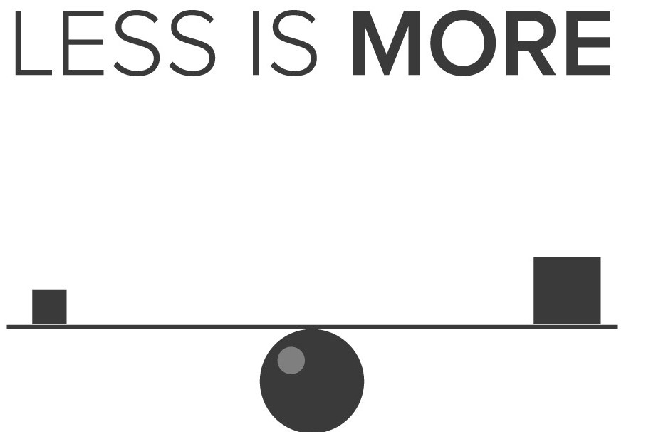
LESS IS MORE
This famous saying by Ludwig Mies van der Rohe represents minimalism more than anything.
In visual design, Minimal is the sweet point where Design is serving its purpose while being efficient and practical at the same time. Not only will your Application look clean, it will also be of higher-quality and more refined.
LIGHTER IS BETTER
Minimal designs are always lighter than those cluttered and complex designs with too many elements. These are easy to develop as they only have a few and essential elements. As minimal designs are on the lighter side, this reduces the loading time, promotes better performance, and improves the UI.
SUBCONSCIOUSLY EFFECTIVE
Clutter is growing everywhere on the internet, whether it is spam emails or annoying ad pop-ups and we are on a constant lookout for ways to avoid it. We receive dozens, if not hundreds, of business advertisements through newspaper inserts, internet ads, radio and TV commercials, and more.
This surge in advertising has caused people to learn how to avoid annoying ads. As web designers, we should keep in mind that not only is extra ad clutter on our websites distracting to users, it is also bad for SEO.
ADAPTIVE AND RESPONSIVE
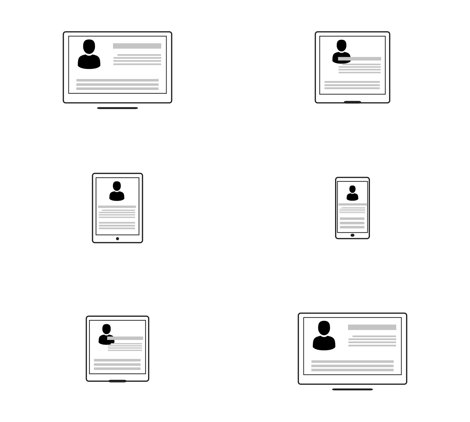
Minimal designs can be ported across multiple platforms with ease as they hold few elements and are less complex, characteristics that make designs more flexible for varied platforms.
- How to achieve minimalism in Visual Design?
COLORS
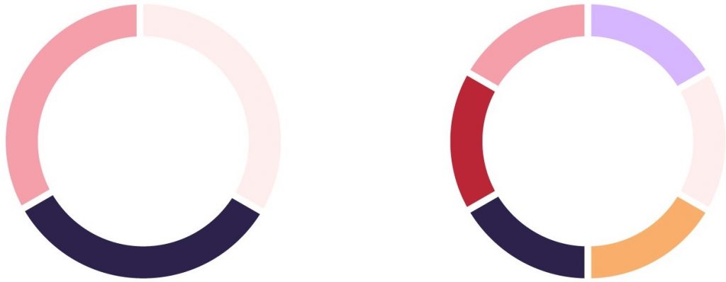
Colors are an invaluable medium to present your interface. It is a feature of great potential in the design of interfaces as it can set both informative and emotional links between the product and the user.
Whether you’re opting for the minimal route or normal, having only 2 or 3 colors on your website is a good idea as this strengthens the chosen colors and doesn’t distract users with too much variety. It is an effective approach of getting the attention of users on particular actions like buying, subscribing, donating, starting to use, etc.
Moreover, from a psychological perspective, the colors usually transfer particular associations and emotions perceived by users, so limited palette makes chosen colors stronger in this aspect.
TYPOGRAPHY

“Typography speaks louder than words”
Do you believe in this statement? You’ll be surprised to know that many high-quality designers don’t understand the value and role of typography in design. Good typefaces are truly vital when using a minimalist design.
Ideally, designers should pay much attention to the choice of typography and never hurry in testing the pairs, sizes, and combinations. The text color, fonts, and typefaces are also seen as strong graphic elements contributing to general elegance and the emotional message conveyed by design.
On the other hand, readability and legibility should not lose their leading positions in the matter of choice.
USING NEGATIVE SPACE
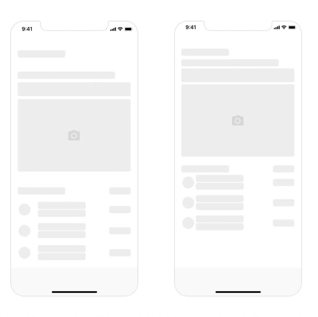
You don’t need more space. You need less stuff.
Negative space or White space is the space between, within and surrounding an object in an image. The positive space is the focus element, the object itself, but the negative space is equally important. In minimalism, it is an effective technique of adding elegance and marking out the core elements.
Also, in terms of monochromatic or limited color palette, white or negative space plays a big role in creating enough contrast.
Well, it’s easy to see that minimalism in UI design has a great number of benefits and presents a good approach for creating user-friendly interfaces. One thing is for sure: the more minimalistic is the interface, the more time and effort the designer should invest in making it clear and functional.
I do hope that this article gave you an idea of minimalism in UI design and that it made you notice the beauty of simplicity.
If you wish to contribute or have any feedback, kindly share it with us via the comment box below or you can write to us at hello@sarvika.com.
Written by Mohit Bairwa
Mohit is an engineer turned self-taught Illustrator and Visual Designer who likes to leave people agape with his minimalist style of designing. He is a B.Tech graduate in Computer Science, but his love for video games and digital artwork made him explore the trippy world of graphics and animation. In his spare time, Mohit likes to stay updated with the new design trends in UI/UX through articles, communities, and blogs.
