Checklist to reduce your eCommerce website’s bounce rate
April 24, 2020 11:24 am | by Sarvika Technologies | Posted in Post
Bounce rate. I bet the term sounds familiar. All the eCommerce portals, whether they are huge brands like Flipkart/Snapdeal/Amazon or small and medium online sellers are forever worried about increasing bounce rates.
And why shouldn’t they be? Bounce rates not only impact the revenue, but a higher rate is an indication for search engines that your page is not helping visitors, and this pushes the website’s rank even further down. Twice the setback.
Today we’ll throw light on the reasons why your website has a high bounce rate and what you should do to bring it down. But before that, we must know what an acceptable bounce rate is.
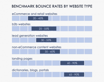
Leading industry experts have found that an acceptable bounce rate for websites that fall under the eCommerce and retail domain ranges between 20% – 45%. The bounce rate defines the number of people who visit a website and exit without making a purchase. Since it is based on human behavior and psychology, it is near impossible to eliminate.
Therefore, if your eCommerce website’s bounce rate falls between the defined benchmark, then congratulations because you might be on a safer side (keeping other SEO aspects in mind). But if it isn’t the case, then take the help of the below-mentioned points to bring your online store’s bounce to an acceptable level.
- Optimize the search bar.
Buyers visit any online store with either an intention to buy something specific or just to browse the latest products in the market. In either case, a search bar comes to their rescue. If your online store’s search bar is not prominent or easily visible, then buyers will leave the page without any second thoughts. The search bar provides ease in navigation and locating products.
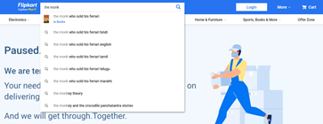
In addition to better placement of the search bar, it should also provide enough space, in terms of character length to aid in the search. The search bar should also provide suggestions like every search engine as it helps in enhancing the user experience.
- Minimum load time.
People hate waiting for web pages to load. It cannot be more straight forward than this. Your eCommerce website should not take more than 3 seconds. Need one reason why. Researchers at Google are of an opinion that websites which load in one to three seconds will experience a possible 32% increase in bounce rate. Whereas websites that take more than 3 seconds will experience a possible 90% increase in bounce rate.
- Use offers to hook visitors.
Reduction in the bounce rate should not only stop visitors from leaving the website but also boost sales. Displaying banners of ongoing offers and discounts on the homepage will not only catch the viewers’ attention, but it will also compel them to visit the product page and maybe even make a purchase. A sense of urgency or limited availability or excitement triggers people to explore more.
- Don’t let ads spoil the experience.
Nothing spoils the mood like the unwanted and undesirable advertisements. With the increasing trend in affiliate marketing, websites nowadays are flooded with advertisements. Though ads help in pushing sales, they can also significantly increase the bounce rate when visitors find them intrusive and irritating. Place advertisements on the web page in a way that they are not hitting buyers on the face.
- Responsive design is both important and necessary.
There are close to 3.8 billion smartphone users in the world. These devices enable computing on the go, which is not limited to conducting business and sending emails. It is common for people to shop online either using a mobile dedicated application or through a mobile web browser. Progressive web apps are a part of a responsive website design in which the user does not have to install a mobile app and shell out memory and RAM space when they can enjoy the same app interface via a web browser. Hence make sure that your eCommerce website is both responsive and designed using a PWA codebase.
- Keep the website decluttered.
A tidied room looks more inviting or one that is messed up? A cupboard with clothes neatly arranged seems better or the one with every piece thrown inside? Maximum of people (exceptions are always there :P) will pick the former because managed spaces help in decision making. The same stands true for eCommerce websites. Design the website; its content, graphics and their placement in a way that makes it easy for people to navigate, choose, and purchase.
- Categorize well.
How will you react to finding sexual wellness products under the grocery essentials category? Or books under the men and women fashion section? The website will seem to be handled by a noob and you’ll simply click on the exit button. A huge reason for the high bounce rate in eCommerce websites is wrong product categorization. You should dedicate time and resources to sort product categories based on industry-wide accepted categories to benefit from familiarity.
- Hidden costs.
You’ll be surprised to know that online stores experience high bounce rates during the checkout process as well. It is more specifically called cart abandonment. Hidden costs in the form of high shipping charges, taxes, and other store-related costs. The solution is to keep such unavoidable costs transparent and show them at every product page to avoid nasty surprises during the checkout.
- There are many other ways.
The techniques shared above are derived from experiences of other eCommerce websites. The ways are not limited to these points only, there are many other methods like placing call-to-actions (CTAs), offering 24×7 chat support, detailed product information, and more.
eCommerce platforms have made it easy to build and operate an online store. But running a successful venture online is not an easy task. Business owners and digital marketers learn something new every day. We’d like to know about your experiences of running an eCommerce website. Reach out to us via the comment section below or share your story at hello@sarvika.com
Written by Sarvika Technologies
Sarvika Tech is a team of young, energetic, and technology-loving people on the journey to help companies achieve their goals by supporting their IT needs. In a nutshell, we are a people’s company where the priority is their knowledge enhancement and career development. We believe that focusing on our most important asset, the team, will enable us to push boundaries and deliver ingenious IT solutions.


