Ace Your ECommerce Game Using These Conversion Rate Boosting Tips!
June 10, 2021 5:10 pm | by Sarvika Technologies | Posted in eCommerce
eCommerce businesses are concerned about one thing – ease of managing a business & revenue. With almost hundreds and thousands of new sellers joining the eCommerce bandwagon every day, it is no longer easy to grab attention and compel the visitors to hit the buy button.
One can argue that the pandemic has shown the immense growth potential of online shopping because people want to buy from the safety of their homes. Still, locking a good eCommerce conversion rate is proving to be a challenge for online store owners. Quite a paradox, isn’t it?
What is the eCommerce conversion rate, and how to calculate it?
eCommerce conversion rate is defined as the ratio of total transactions to total sessions that have taken place on the website. In simple terms, it outlines the number of visitors who have purchased out of the total visitors in a particular period. eCommerce conversion rate is expressed in percentage.
eCommerce Conversion Rate = Total Number of Store Transactions / Total Visits to the Website * 100
The next question that comes to mind is: what is a decent eCommerce conversion rate? The location of the target audience, the type of product, the type of industry, etc., are factors that influence the conversion rate when it comes to online shopping.
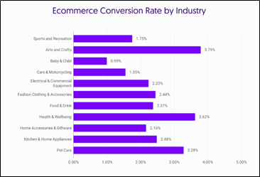
A survey conducted by Growcode informs that the arts & craft industry has the highest conversion rate at 3.79%, followed by health & wellbeing at 3.62% and pet care at 3.28%.
However, country-wise data showed Germany at the top with an eCommerce conversion rate of 2.22%. The US and the UK stood at 1.96% and 1.88%, respectively.
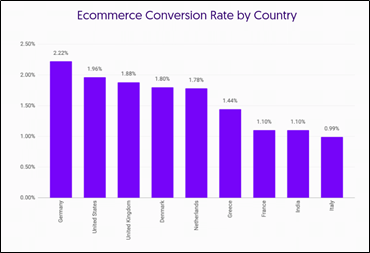
As per the industry experts, a conversion rate between 2.5% – 3% is considered great for online sellers.
Enough of the numbers. Let’s move onto the main agenda: how to boost the eCommerce conversion rate? Here’s a list of our ten-handy tips.
Showcase your brand’s value proposition
Many eCommerce owners do not make value propositions a part of the website because most do not know what it means.
A value proposition is a statement that outlines clear and measurable benefits that the prospects will receive when they buy the products/services.
For example, Day Owl, an accessory selling website, highlights how their products are made using recycled material. And by purchasing their products, the customers will contribute towards a better tomorrow.
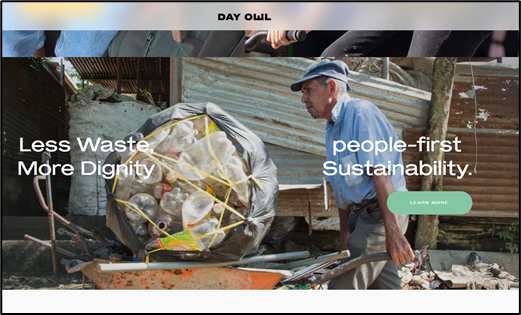
Value propositions help customers see your worth and encourage them to always buy from your website.
Customers can be bored with a tedious checkout process
Visitors hate going through long checkout processes. Wherever possible, try to work with minimum information that can ensure correct and timely delivery. Also, adopt one-page checkout instead of multi-page and accordion checkout processes.
In addition to the above, empowering the visitors to buy products/services in one click will also significantly boost the conversion rates. You’d be surprised to know that Amazon once held the 1-click patent and it helped this eCommerce giant nail a strong position in the market.
Focus on the hero image
Hero content is the first thing customers see when they visit the website. There are multiple ways to attract their attention with hero content. Motion pictures are perfect for selling niche products, whereas dynamic or carousel images are great for selling everyday products and show new additions, products at discounts, etc. Hence, make sure your hero content highlights the store’s or product’s USP, top-selling products, etc.
CTA is the key
The demand for writers (especially copywriters) has increased significantly since the online business boom. Call-to-Action or CTA buttons act like triggers that compel buyers into taking action. Hence, the CTAs on your website should hit the bullseye every time.
For example, Grey Goose stressed on the type of product offered instead of using a simple buy as their CTA. This CTA is different from what users generally expect. Hence it has the ability to grab their attention.

The dropdown menu is a must-have
The dropdown menu is your eCommerce store’s google map that will guide visitors and give them an overview of the store.
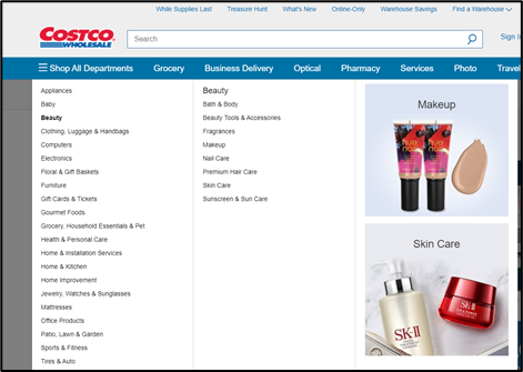
You can include a dropdown menu that lists all the categories and subcategories or opt for a supernav or mega menu, which provides graphic components of various products. Whatever type you choose, the dropdown menu acts as a blessing for visitors.
Work on the cart abandonment rate
This list will be incomplete without mentioning the cart abandonment rate, which as per a survey conducted by Sleeknote, stands at a whopping 69.57% across all industries. Therefore, improving cart abandonment will directly impact the conversion rate.
So, what are the reasons behind high-cart abandonment? Trust issues, high shipping costs, complex checkout process, negative user experience, lack of payment options, hidden tax charges, etc.
Building an email list and giving price drop and sale alerts to the subscribers, placing exit intent pop-ups, keeping the pricing as transparent as possible, stimulating brand loyalty through promotions and offers, etc. These are some ways developed by expert digital marketers and eCommerce consultants to improve the cart abandonment rate.
Keep throwing offers
Offers and discounts are the best ways to boost the eCommerce conversion rate. It is crucial for newly launched online businesses because it gives them a ground to stand amongst players already dominating the market. Discount on first orders, discount on referrals, seasonal and festive discounts are tricks used in the trade. Think of the rate of customers you can get by offering a small discount which actually is an investment for you.
A source says, Macy’s offers an extra 25% off to the users who join their email list to not only improves the conversion rate but also helps the company reach the buyers’ inboxes directly.

Provide a money-back guarantee
Buyers feel secure when they purchase a product covered by a money-back guarantee. Online stores that include a no-questions-asked refund policy enjoy better sales and more loyalty.
Have a live chat tool
Just like the presence of a salesperson in a brick-and-mortar store makes it easy to shop, having a live chat option always comes in handy. Visitors always have some queries regarding the product or any other policy which keeps them from clicking the purchase button. A human connection in the digital world encourages them to tap the buy button.
Win the customer’s trust
In the end, online shopping is all about trust. Lack of physical contact between the seller and the buyer, in some cases, influences the purchasing decision. It is particularly important in heavy-value purchases like electronics. This is where testimonials, user ratings and reviews, integration with reliable payment and shipping portals, and similar features come into play.
Providing a space for the users to share their experiences with the product will develop their trust in the brand. Also, positive reviews from such users will influence potential buyers to make the purchase. Hence, pushing the conversion rate higher.
Here’s the secret.
The buyers’ behavior, helping the customer is the central tenet to increasing the conversion rate. It is highly beneficial to study how the visitors are interacting with the eCommerce website. Points like: pages with the highest drop rate, products bringing highest and lowest revenue, reviews, etc., will provide precious insights and give ideas for further improvement.
Written by Sarvika Technologies
Sarvika Tech is a team of young, energetic, and technology-loving people on the journey to help companies achieve their goals by supporting their IT needs. In a nutshell, we are a people’s company where the priority is their knowledge enhancement and career development. We believe that focusing on our most important asset, the team, will enable us to push boundaries and deliver ingenious IT solutions.
